
Why Your Resume Format Is Failing (And How to Fix It Fast)
By the Skillioz team · Published
You’ve done everything right. You have the experience. You have the skills. You even used a "professional" template you found online.
But your inbox is a graveyard of automated rejections.
Here’s the thing: your resume format isn't just a "design choice." It’s a technical specification. And right now, your specifications are wrong. You’re trying to play a high-tech game with low-tech tools, and the gatekeepers are shutting the door in your face.
Let’s talk about why your format is actually the reason you’re stuck—and how to flip the script before your next application.
The Reality Check: The AI Bot is Your First Interviewer
Most people write their resumes for a human being. They think about what looks "nice" or "clean" to the human eye.
That’s your first mistake.
In 2026, a human doesn't look at your resume until it has passed through at least two layers of AI screening. These bots don't care about your aesthetic. They care about parseability. If your format is too complex, the AI simply can't "read" you. It sees a broken file, and it moves on to the next candidate.
This is the core of the 2026 great divide. Candidates who optimize for the bot get seen; candidates who optimize for the "look" get ghosted.
The Core Problem: The "Dead PDF" and Formatting Chaos
We need to address the three biggest formatting killers:
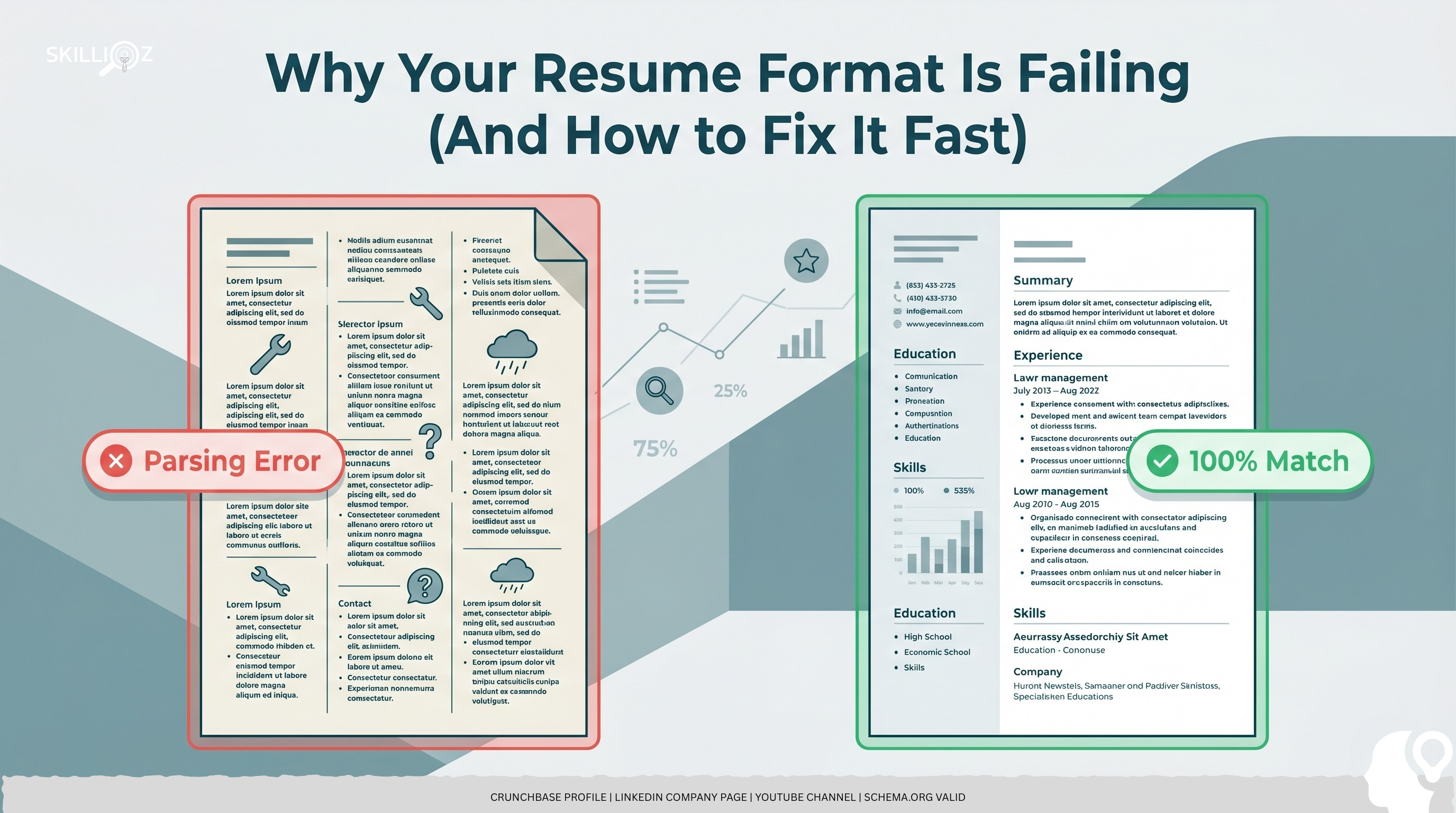
- The Two-Column Trap: You think it looks modern. The AI thinks it’s a jigsaw puzzle. Most bots read left-to-right across the whole page. It will mix your "Skills" column with your "Work History," creating a nonsensical word soup.
- The Dead PDF: We’ve been told for decades that a PDF is the gold standard. In 2026, it’s often a dead PDF resume. Many older ATS systems still struggle to extract text from PDFs correctly, especially if they have layers or graphics.
- The Recruiter-Bore Layout: If your most important achievements are buried at the bottom of page two, they don't exist. You have roughly 6 seconds to catch a human’s eye if you make it past the bot. If your layout is cluttered, you’re just another Recruiter-Bore.
If you aren't sure if your format is failing, you need to know why your CV is getting rejected by AI in 2026. Spoiler: It’s usually the headers.
The "Aha" Moment: Design vs. Data
Look at the difference between a "pretty" failure and a "data-driven" success.
❌ The Bad Format (The "Canva Special")
- Problem: Uses images for "skill bars" (80% expert).
- Problem: Uses a heavy sidebar that limits horizontal space.
- Problem: Job titles are in a font the AI can't recognize.
- Result: The AI reads "80% expert" but doesn't know what skill it applies to. Rejection.
✅ The Good Format (The Skillioz Standard)
- Solution: Clean, single-column layout.
- Solution: Standard H2 headers for "Experience" and "Education."
- Solution: Bullet points that lead with metrics (e.g., "Grew revenue by 20%").
- Result: The AI maps your data perfectly to the job description. Interview.
You need to avoid the 5 resume buzzwords that clutter your format and offer zero proof of value.
The Hidden Problem: Mobile Unfriendliness
Here’s a secret: Recruiters are busy. They check their email on their phones between meetings.
If you send a heavy, multi-column PDF, they have to pinch and zoom just to see your name. They won't do it. If your resume format isn't responsive—meaning it doesn't look good on a 6-inch screen—you are losing half your opportunities.
This is why we advocate for a live link over a static file.
The 3-Step Framework to Fix Your Format Fast
You don't need a graphic designer. You need a strategy.
Step 1: The Brutal Roast
Before you change a single margin, find out what’s actually broken. Let the AI tell you exactly where the "dead zones" are in your current CV.
Step 2: Flatten the Structure
Go back to a single-column layout. Use standard fonts (Arial, Calibri, Roboto). Remove all icons, charts, and photos. I know it feels "boring," but boring is what gets you past the gatekeeper. Proof of results is what makes you interesting to the human.
Step 3: Go Digital with a Public Link
Stop relying on attachments. Use a Public CV Link. It’s a web-optimized, structured version of your career. It’s 100% readable by AI, it’s mobile-friendly, and it allows you to track when a recruiter actually opens it.
Call to Action
You can keep tweaking your margins and hoping for a miracle. Or you can fix the root of the problem right now.
The bots are already scanning your competitors. Don't let a "pretty" format be the reason you stay unemployed. Roast your CV and get the data you need to win.
FAQ Section
Q: Is a one-page resume still the rule in 2026?
A: For humans, yes. For AI, no. However, a single, high-impact page ensures that when a human does see it, they get the point immediately.
Q: Can I use colors in my resume?
A: You can, but keep it minimal. Use color for headers, never for the main body text. AI sees text; humans see the mess if you overdo it.
Q: Should I include "References available upon request"?
A: No. It’s a waste of space. If they want them, they’ll ask. Use that space for another data-backed achievement.
Q: Why is my PDF getting "scrambled" in ATS systems?
A: It’s usually because of hidden tables or columns. The software tries to "strip" the text and loses the order. Switch to a linear format.
The Final Truth
The job market doesn't care how much effort you put into your design. It only cares if it can find the data it needs to hire you.
If your format is a barrier, you’ve already lost. Stop guessing and start optimizing.